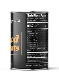

CONTRIBUTION: Sole designer
SCOPE: Brand conception, packaging design
PROJECT DETAILS: When analyzing other canned food labels in the grocery store I was confronted with a sea of over saturated images and bright flashy designs with little negative space. I set out to make the exact opposite of that. I chose a dark background and simple text with a minimalistic outline of the food inside to make it clear and easy to read. The black background and the script font for the logo added a level of sophistication I didn't see in my research. I also focused on making the canned food labels easy to read with text being the largest part of the principle display panel. To add more character and personality to brand I added physical changes to the type representing what state the food inside would be in (ie a slice through the world slice or crushing the letters together for the word crushed). I wanted to create a brand that the consumer could instantly recognize both on the grocery store shelf and in their pantry at home.
TARGET MARKET: Upscale grocery shopper looking for clean ingredients and simple labels.


